The mess I got myself in and how I got out

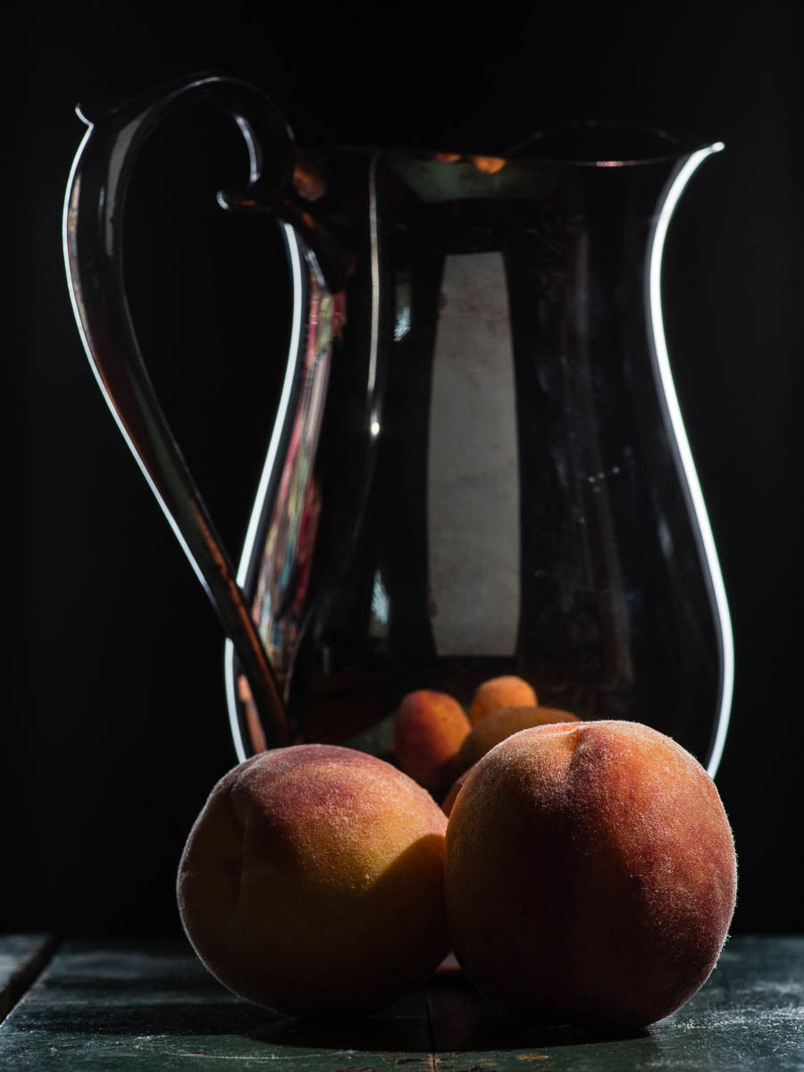
It all started innocently enough — I found the silver pitcher of my still life dreams at the local thrift store for only $2.99. After a bit of de-tarnishing it was so pretty and shiny and I immediately began to dream up a still life arrangement with the peaches ripening on my counter: shiny and silvery contrasting with fuzzy and peachy. I naively forgot that I was holding in my hand a photographer’s nightmare: an object with a highly reflective surface. So, time-bomb ticking away, I put it together using my normal set-up (side soft box)…and then I got this — KABOOM!:
You see that reflection in the pitcher? Can you see that bright, blown out highlight of the soft box? Really, how could you miss it? Would this have been different if I’d used my big soft box instead of the little one? Maybe, or it just would have been a bigger blown out section. No matter how I positioned the light, or upped the ambient light or dialed down the aperture, I couldn’t get rid of that ugly reflection!
Google to the rescue
Now, I had a bit of a time pressure on getting this photo. Dinner time was approaching and I had no idea what to make to feed everyone. But beyond that, I really wanted to use this picture for my Sunday Still Life submission on G+. (By the way, join the fun! We are a friendly bunch – and you probably already know a lot of us there!)
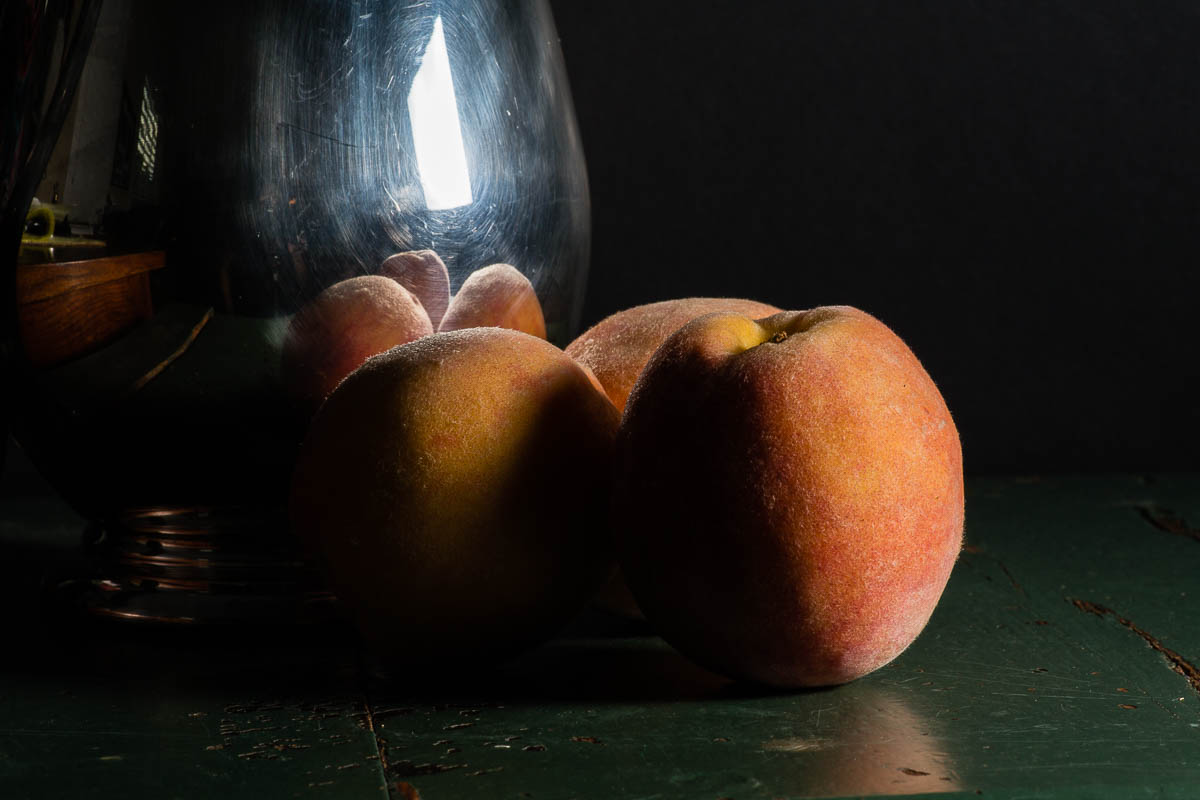
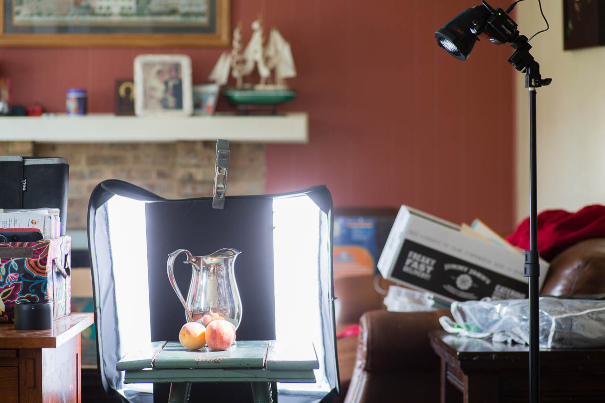
A little reading later and I came across a very cool trick. By putting the black board behind the silver pitcher but directly in front of the soft box, I was able to block the light causing the ugly reflection. The soft box light is so big that it is able to wrap around the black board and still hit the sides of the pitcher making for some beautiful and well-defining rim light.
I then used my grid to put a tiny bit of light on the peaches to light them and better define their fuzzy texture. They needed a bit more light in the front and so then I threw in the reflector.
This should explain the set-up better:
Highly Reflective Surface Nightmares
Now I understand why this is such a hard thing to light. And there are more than a few things that I am not thrilled with.
- I really don’t like the way the reflector shows up. I thought it might help to show the silver color but I think it just looks distracting. But without it, the pitcher just looked like clear glass.
- I wish the pitcher actually looked silver. I think the trick is to light the environment and not the subject with this type of object. How to do that will be the next hurdle I tackle.
- Now I am regretting cleaning off the tarnish…if I had left it then I probably could have gotten away with the soft box on the side.
Plenty to learn still — but that’s the fun of it all, right?
So much to learn about lighting isn’t there? I too have struggled with silver even tarnished pieces. Love your blog title!