“Make your work beautiful. Make it simple. Make it clear. Put it out there. Cast off the illusion that you can control the results.” — John McWade Before & After/Design Talk
I think that may be my new motto. Or at least the standard that I hope to reach with my photos (dare I say, art?).
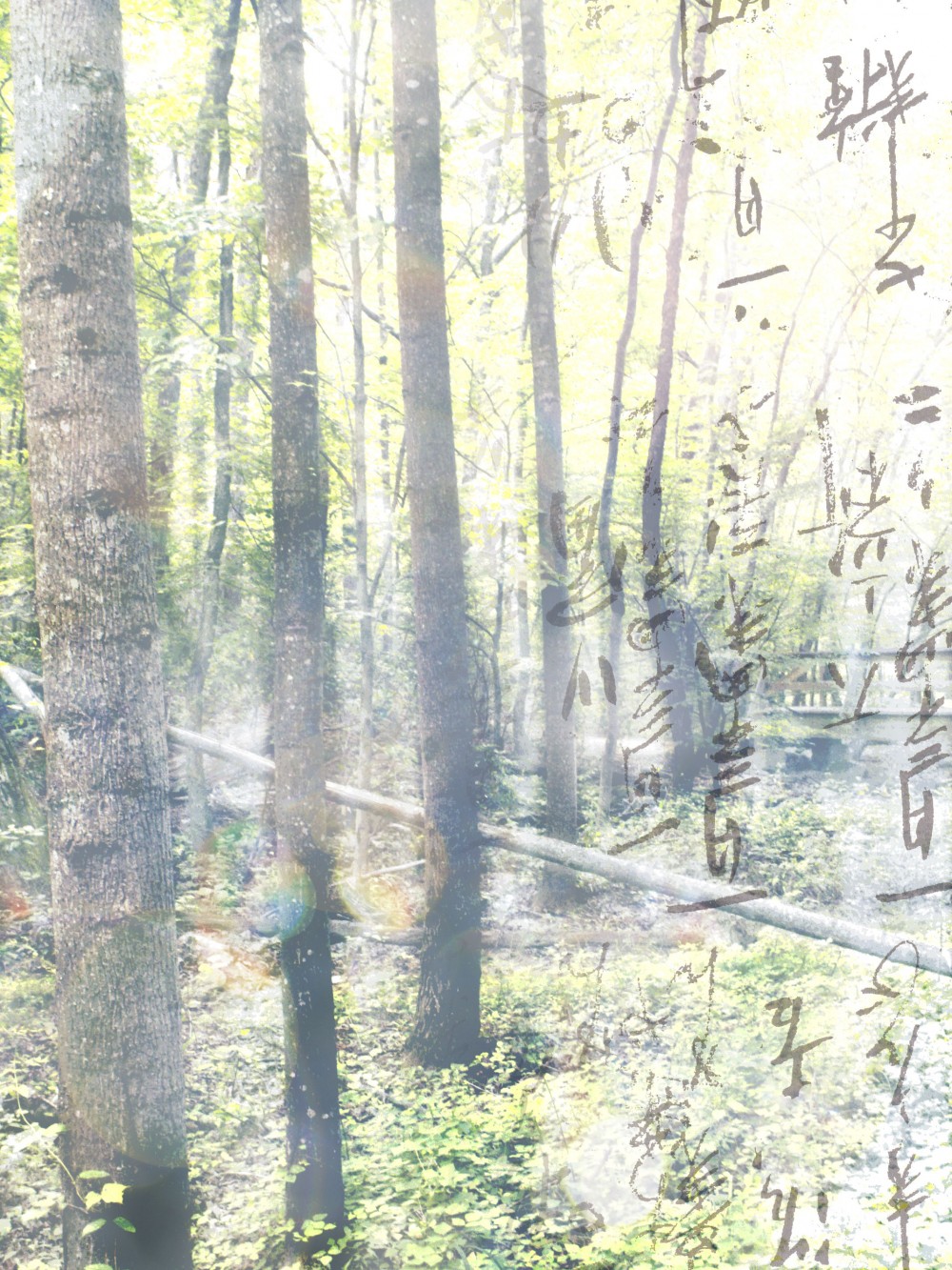
And that brings me to project 3 for week 1 of the digital layers class. I’ve had this photo since last year’s World Photo Walk Day. I really liked the way the trees were in a straight line and seemed evenly spaced — even though we were in the middle of the woods. I thought the diagonal direction would act like a converging line and draw the eye to the little foot bridge. It didn’t seem to work.

So then I started really playing with it.
Dozens of adjustment layers later, I still couldn’t get it close to what I was looking for. I thought it would be the perfect candidate for the 3rd project.

My first inspiration was to make it darker and gloomier — but when I stood back the final work looked more like a train wreck. The textures didn’t see to have any rhyme or reason to them and I don’t think they really added anything to the photo.

I turned off those layers and added new ones. Since darker didn’t work, I decided to try lighter and lo and behold: I think it worked!! At least I like the results of the final version much better.
